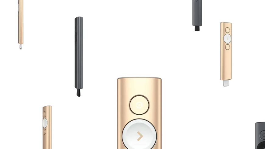
This is one of my first projects during my tenure at Logitech, and easily the one I’m most proud of. The product page no longer looks like this anymore as Logitech, over the years, has moved away from custom one-off pages and moved more towards standardized templates.
This project consists of two pages to introduce users to an innovative new kind of presentation remote. What made it unique is that, instead of just being a standard previous slide/next slide device, it was essentially a mouse you could use in the air. It had minimal controls and a sleek, almost Apple-esque aesthetic.
I was the sole frontend developer working on this project and was in charge of making sure I could bring the design team’s static mockups to life. I worked closely with the lead designer to make sure we would make this an exciting, memorable section of the site as this represented a flagship product the company planned on promoting heavily.
Many innovative tricks were invented and implemented to make sure we could have feature-rich, animation-heavy pages with minimal CPU and bandwidth impacts for the end user. Much of what looks like video or 3D on these pages is actually just highly choreographed programmatic animations of simple 2D elements. The end result was something that worked flawlessly on any browser or connection type, including mobile.